Tagged in

coronavirus

A Graph is a Visual Argument, Not a Fact

A Graph is a Visual Argument, Not a Fact

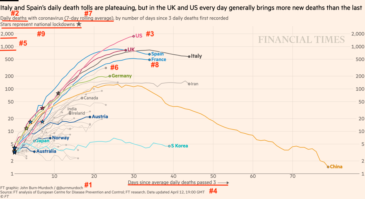
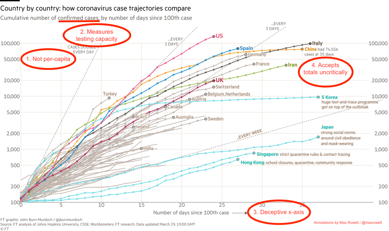
A common mistake that has become more common recently is treating graphs as indisputable facts. The truth is far messier: any data visualization is the product of numerous subjective decisions. An informed reader should be able to identify these decisions and understand their impact. Charts should be approached with the …
Data Journalists Need to Do Better

Data Journalists Need to Do Better

The coronavirus pandemic is the first data-driven crisis. The key numbers – infections and deaths – are easily understood, widely available, and constantly changing. As a result, the outbreak has led to more charts, graphs, comparisons, and projections than any event in history. While data should be at the heart of any …