Data Journalists Need to Do Better
The coronavirus pandemic is the first data-driven crisis. The key numbers – infections and deaths – are easily understood, widely available, and constantly changing. As a result, the outbreak has led to more charts, graphs, comparisons, and projections than any event in history. While data should be at the heart of any public health response, the current crisis has led to widespread uncritical analysis of clearly flawed data.
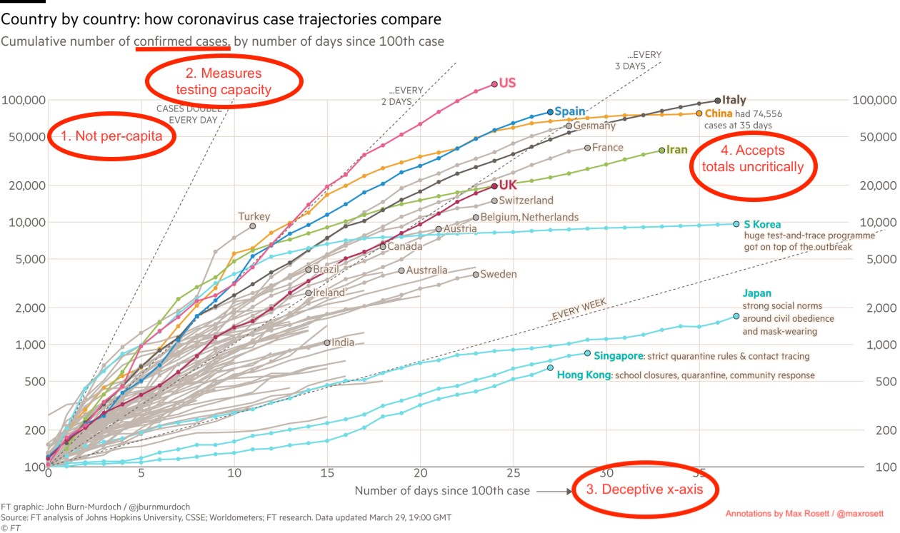
Take this chart from the Financial Times which shows confirmed case counts day-by-day since each country hit 100 cases. The data is carefully sourced, beautifully displayed, and thoughtfully annotated. As a result, the chart has been shared widely (including by Nobel laureate Paul Krugman) and seems to be influencing public perception of the US response. Unfortunately, the chart has at least four serious flaws:
1. The y-axis is not per-capita. The countries shown on the chart have wildly different populations. The US, for instance, has a greater population than Germany, France, Italy, Spain and the UK combined.
2. Confirmed cases measures testing capacity, not infections. In this fast-moving pandemic, the number of infections has consistently outstripped testing capacity in almost every country including the US. As a result, a graph of confirmed cases tends to be a graph of testing capacity. (South Korea and Hong Kong are notable exceptions to this.)
3. The x-axis is deceiving. The chart is indexed by days since 100 confirmed cases. Due to the inexcusably slow rollout of testing in the US, though, the virus was already widespread when that milestone was reached.
4. Country level totals are uncritically compared. In addition to the near universal problem of limited test availability, countries take different approaches to counting cases. China, for instance, doesn’t include asymptomatic cases in their infection total. And of course, there’s the separate risk that some countries are outright falsifying the data that they share with the world.
The bottom line is that this graph is deceptive at best. The choice of axes pushes the US datapoints up and to the left, thereby exaggerating the steepness of the trajectory. Confirmed case counts are important for scoping the size of the pandemic within a country, but provide limited insight when comparing across time or across countries. It may be tempting to say that if every country is underreporting, we can still make valid comparisons between them. Unfortunately, the magnitude of underreporting varies wildly from place to place and from week to week. In data analysis, as in life, two wrongs don’t make a right.
To be clear, there are many legitimate criticisms of the US response to the virus. How could there not be, with a pandemic that's infected hundreds of thousands and led to more than 2,500 deaths? That makes it all the more disheartening to see widespread distribution of such a misleading visualization. There's no shortage of carefully reasoned lines of critique or solid pieces of evidence, and yet this one is among the most widely shared.
The whole affair also provides a painful lesson for my fellow practitioners of data analysis. The team at the Financial Times has clearly done a tremendous amount of work to gather and display data. But when the available data is inadequate, even the best analysis is useless. As computer scientists say, garbage in, garbage out.
Undoubtedly, many people who shared the chart are aware of and even agree with every objection presented above. But well-educated Americans show tremendous deference to detailed data and beautifully designed charts. Visualizations that tell a sensational story will still go viral if they’re flawed. With that in mind, data journalists should take the opportunity to ponder their professional responsibilities to the public.