A Graph is a Visual Argument, Not a Fact
A common mistake that has become more common recently is treating graphs as indisputable facts. The truth is far messier: any data visualization is the product of numerous subjective decisions. An informed reader should be able to identify these decisions and understand their impact. Charts should be approached with the same skepticism applied to other carefully crafted arguments, regardless of medium.
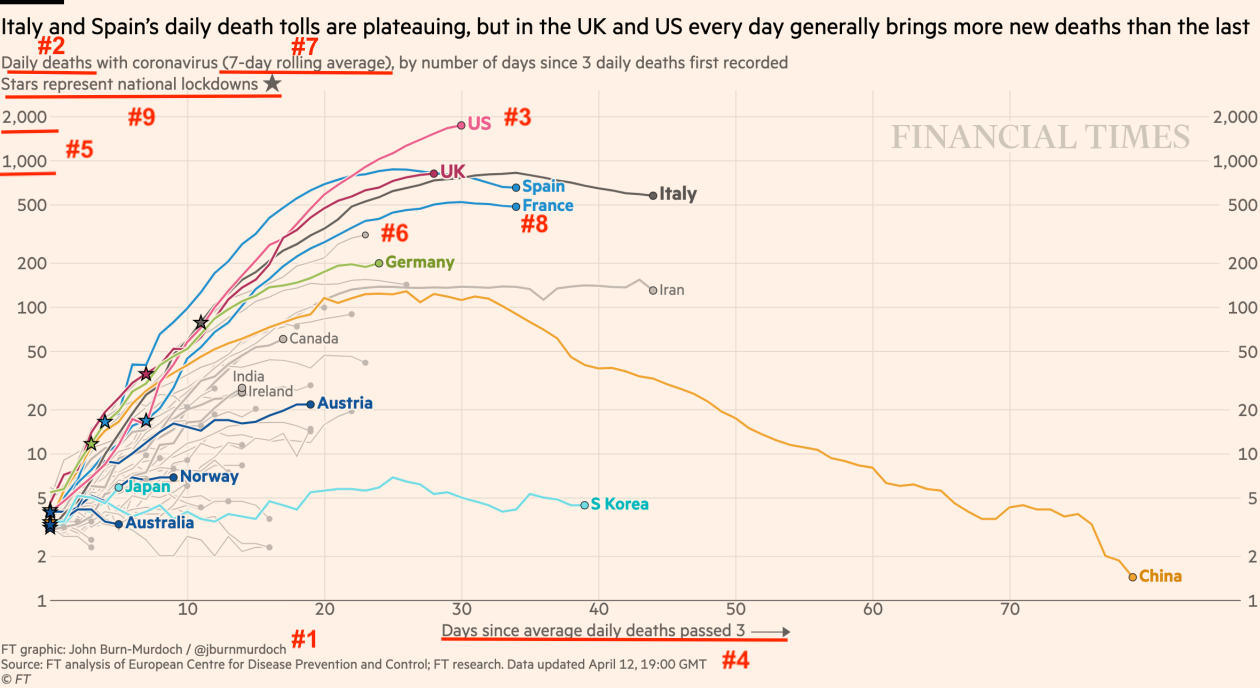
Consider this graph from the Financial Times, which argues that the US has had the worst coronavirus outbreak of any country in the world:
These are at least nine key decisions that went into making this graph:
1. Is this data worth graphing? The severe problems with country level data are well documented. Each country has different testing capacity, different methods for counting coronavirus deaths, and different levels of candor in official statistics. With that in mind, even choosing to create this graph is a significant decision. Data of such low quality is worse than useless and frankly undermines the entire enterprise. Having made that point, though, I’ll set aside the issue of data quality for the rest of this piece.
2. What metric should be graphed? Deaths are the most important outcome (compared to infections or hospitalizations) and are probably more accurately counted (although there’s still evidence of undercounting), but death rate can also vary due to the demographics of each country.
3. What’s the correct unit of analysis? Country level comparisons are an obvious option, but in practice the outbreak occurs at the level of a region or even a single city. This is true both as a matter of epidemiology and as a matter of policy, since in the US most political responses have been at the state level.
4. What’s the correct starting point for the x-axis? The pandemic reached different countries at different times. If we want to easily compare trajectories, starting the chart on the day a country reached 3 deaths is a reasonable option. However, a different threshold could have been chosen. Alternatively, a per-capita threshold could have been chosen, like the day on which deaths reached 1 person per 10 million. 5. Should the y-axis be absolute or per-capita? This is difficult to separate from the choice of x-axis. Having chosen 3 deaths per day (an absolute threshold) as the starting point, it makes sense to keep the y-axis in absolute terms as well.
However, this again runs into the regional nature of the pandemic. Most countries hit the 3 deaths per day threshold following the first outbreak in a major metro area. In a country like Italy, that first outbreak was soon followed by outbreaks in most of the few dozen cities with populations over 100,000. In the United States, though, though, the initial outbreak in Seattle was followed by outbreaks in many of the nearly 400 cities with populations over 100,000. So, while using a per capita y-axis would be inconsistent with the chosen x-axis, the best option is to use per capita figures to construct both axes.
6. Which countries are highlighted or excluded? The chart greys the name of some countries, like Iran, while leaving other trajectories unlabeled entirely. A bit of digging shows, for instance, that hard-hit Belgium is the unlabeled curve just below France.
7. How should the data be smoothed? The chart shows seven day rolling averages rather than actual daily counts. This smooths the data and makes trends more apparent, but the smoothing could be skipped altogether or performed over a shorter window.
8. Which data anomalies are adjusted away? France’s daily deaths jumped sharply following an effort to report deaths in nursing homes. This jump has been removed from the data, leading to the smooth curve shown on the graph. Given the manifest flaws in every country’s data, though, it’s strange to only adjust for this single anomaly, particularly since it does reflect actual deaths.
9. Which events are annotated? The graph contains a star marking lockdowns at the country level. This reflects two decisions: first, identifying lockdowns as an event worth annotating and second, determining that lockdowns (like the rest of the data) should be analyzed at a national rather than regional level.
With so many degrees of freedom, this graph could be constructed in thousands of ways. Crucially, most of the decisions are not narrow technical considerations. By making this particular graph, the author expresses opinions on the quality of the underlying data, the nature of how pandemics spread, the importance of lockdowns as a policy response, and the virtue of national vs local action. There is no room to claim that he is “just showing the data.”
A well-designed graph will always be a powerful tool for conveying an argument. But astute readers should recognize graphs as just that – arguments – and approach them with healthy skepticism. Even data-driven arguments are not above reproach.